🧩 Components
🧩 TomSelect
This component replaces Select2.js with a vanilla JS alternative, so it does not depend on jQuery.
Install
Use either CDN method or npm which described in Configuration page.
I'll use modern and prefered way in this tutorial .
Then, in your app.js import the packages:
| app.js | |
|---|---|
Basic Usage
<x-hwkui-tom-select
  class="h-full"
  wire:model="customer_id"
  label="Customer"
  placeholder="Select customer..."
>
  <!-- Default empty option -->
  <option value="">Select Customer...</option>

  <!-- Dynamic options -->
  @foreach ($customers as $c)
  <option value="{{ (string) $c->id }}" wire:key="{{ $c->id }}">
    {{ $c->name }}
  </option>
  @endforeach
</x-hwkui-tom-select>
Passing Additional TomSelect Options
You can pass extra options via the :options attribute:
<x-hwkui-tom-select
  wire:model="customer_id"
  label="Customer"
  :options="[
        'maxItems' => 3,
        'create' => true,
        'plugins' => ['remove_button']
    ]"
>
</x-hwkui-tom-select>
More information about TomSelect setup can be found at the official website Tom Select
🧩 FlatPicker ( DateTime picker )
This component provides an elegant datetime picker powered by FlatPickr, ready to use in your Laravel Livewire app with a clean, customizable Blade syntax.
Install
Use either CDN method or npm which described in Configuration page.
I'll use modern and prefered way in this tutorial .
edit app.js
| app.js | |
|---|---|
Basic Usage
<x-hwkui-flat-picker
  id="datetimePicker"
  label="Flatpicker"
  placeholder="Select Date"
  wire:model="setDatetime"
/>
You can configure default picker options globally in config/hwkui.php
| hwkui.php | |
|---|---|
You can explore all available options on the Options page and see what you can add.
Override Options Per Component
to Override settings for individual instances using the :options attribute:
<x-hwkui-flat-picker
  id="datetimePicker"
  label="Select Date"
  placeholder="Select Date"
  wire:model="month"
  :options="[
                'enableTime' => false,
                'dateFormat' => 'Y-m',
                'altFormat' => 'Y-m',
            ]"
/>
if you want to select only months you must then pass it as :options argument
<x-hwkui-flat-picker
  id="datetimePicker"
  label="Select Month"
  placeholder="Select Month"
  wire:model="month"
  :options="[
        'enableTime' => false,
        'dateFormat' => 'Y-m',
        'altFormat' => 'Y-m',
        'plugins' => [
    [
        'type' => 'monthSelect',
        'config' => [
            'shorthand' => true,
            'theme' => 'dark',
        ],
    ],
],
    ]"
/>
If you want to use Year Select plugin which FlatPicker doesnt provide it directly you must install third party plugin
then add it
| app.js | |
|---|---|
| app.css | |
|---|---|
use it in blade
<x-hwkui-flat-picker
  id="datetimePicker"
  label="Select Year"
  placeholder="Select Year"
  wire:model="year"
  :options="[
        'enableTime' => false,
        'dateFormat' => 'Y',
        'altFormat' => 'Y',
        'plugins' => [
            [
                'type' => 'yearSelect',
            ],
        ],
    ]"
/>
🧩 Drag & Drop File Upload
A premium, accessible, and reactive file upload component designed for Laravel, Livewire, and Tailwind CSS. It supports drag-and-drop mechanics, real-time client-side max file limitations, progress indication bars, and inline image/document previews.
No setup is required since its depends on AlpineJs which comes with Livewire.
Basic Usage
<!-- Multiple Files with Previews & Constraints -->
<x-hwkui-upload
  wire:model="documents"
  multiple
  max="3"
  accept="image/*,.pdf"
  hint="Only images or PDFs are allowed. Max 3 files."
/>
Component API
| Attribute | Type | Default | Description |
|---|---|---|---|
wire:model |
string |
Required |
The backing Livewire public property array/file handler string name. |
multiple |
boolean |
false |
Enables selection or dragging of multiple files simultaneously. |
max |
integer |
null |
Imposes client-side file count safety validations (works exclusively with multiple). |
preview |
boolean |
false |
Renders dynamic thumbnail galleries for images or itemized layout lists for non-images. |
hint |
string |
null |
Overrides the default helper sub-text positioned beneath upload prompts. |
accept |
string |
* |
Valid standard file mime-type constraint filters forwarded directly to native browser dialogs. |
🧩 Password Strength Indicator
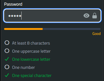
A lightweight, client-side password strength indicator.
| Attribute | Type | Default | Description |
|---|---|---|---|
name |
string |
password |
The name or wire:model of the target input. |
checklist |
boolean |
true |
Whether to display the list of password rules. |
rules |
array |
(See below) | The specific rules to validate against. |
Customizing Rules
By default, the component checks for Length (8), Uppercase, Lowercase, Numbers, and Symbols.
You can override these rules by passing an array. Set a rule to false to disable it entirely (it will be removed from both the UI and the scoring logic). Set length to an integer to define the minimum character count.
<!-- Example: Require only 6 characters and a number -->
<x-hwkui-password-strength
  name="password"
  :rules="[
        'length' => 6,
        'uppercase' => false,
        'lowercase' => false,
        'number' => true,
        'symbol' => false
    ]"
/>
Basic Usage
Place the <x-hwkui-password-strength> component directly below your password input. Ensure the name prop matches either the name or wire:model attribute of the target input.
<flux:field class="mb-4">
  <flux:input wire:model="password" type="password" />
  <!-- Connects to wire:model="password" -->
  <x-hwkui-password-strength name="password" />
</flux:field>
🧩 Select2
Install
Use either CDN method or npm which described in Configuration page.
I'll use modern and prefered way in this tutorial .
| app.js | |
|---|---|
Basic usgae
<x-hwkui-select
  wire:model="selectedItem"
  label="Select User to PLay"
  placeholder="Select a user Babe"
>
  @forelse ($users as $user)
  <option wire:key="{{ $user->id }}" value="{{ $user->name }}">
    {{ $user->name }}
  </option>
  @empty
  <option value="">No options available</option>
  @endforelse
</x-hwkui-select>
Make sure to include Livewire and the component's scripts on your page.
you can pass options for Select2 like via component
<x-hwkui-select
  wire:model="selectedUser"
  label="Choose User"
  :options="$options"
>
</x-hwkui-select>
or direct array
<x-hwkui-select
  wire:model="selectedUser"
  label="Choose User"
  :options="[
         'placeholder' => 'Select an option',
        'allowClear' => true,
        'multiple' => true,
    ]"
>
</x-hwkui-select>
🧩 DateTime Picker
This component provides an elegant datetime picker powered by Tempus Dominus v6, ready to use in your Laravel Livewire app with a clean, customizable Blade syntax.
Developer might abandoned this Project
As stated in official website This project is no longer active or supported
Install
Use either CDN method or npm which described in Configuration page.
I'll use modern and prefered way in this tutorial .
Basic Usage
<x-hwkui-datetime
  id="test-datetime"
  label="Test DateTime"
  placeholder="Select Date"
  wire:model="setDatetime"
/>
You can configure default picker options globally in config/hwkui.php
You can explore all available options on the Options page and see what you can add.
Override Options Per Component
Override settings for individual instances using the :options attribute:
<x-hwkui-datetime
  id="test-datetime"
  :options="[
        'display' => [
            'components' => [
                'date' => false,
                'year' => true,
                'month' => true,
                'clock' => false,
            ],
        ],
        'localization' => [
            'format' => 'yyyy-MM h:i:s',
            'locale' => app()->getLocale(),
        ],
    ]"
  class="border-amber-500"
  label="Test DateTime"
  placeholder="Select Date"
  wire:model="setDatetime"
/>
🧩 Jodit Text Editor
Lightweight Blade component powered by Jodit Rich Text Editor, Alpine.js, and Livewire. It features built-in support for two-way data binding, custom toolbar profiles, file/image uploading, and read-only states.
Install
Use either CDN method or npm which described in Configuration page.
I'll use modern and prefered way in this tutorial .
Then, in your app.js import the packages:
| app.css | |
|---|---|
Component API
You can customize the editor instance using the following properties:
| Prop | Type | Default | Description |
|---|---|---|---|
id |
string |
Auto-generated (jodit-{hash}) |
Unique HTML ID for the textarea. |
profile |
string |
'simple' (or config default) |
Toolbar layout profile (full, simple, minimal). |
height |
integer |
null (uses config default: 350) |
Height of the editor in pixels. |
placeholder |
string |
null |
Placeholder text when the editor is empty. |
language |
string |
null (falls back to config) |
UI language code (e.g., 'en', 'ar', 'fr'). |
file-browser |
boolean |
false |
Enables file browser and uploader integrations. |
connector-url |
string |
null |
Custom route name for asset/file uploading handlers. |
disabled |
boolean |
false |
Sets the editor to read-only mode. |
options |
array |
[] |
Raw array of custom Jodit configuration options. |
Basic Usage
Advanced Examples
Using Profiles and Custom Height
Choose from pre-defined toolbar profiles (full, simple, minimal) and set a fixed height:
<x-hwkui-editor wire:model="bio" profile="full" :height="500" placeholder="Write your biography here..." />
Read-Only / Disabled State
You can dynamically bind or statically set the disabled state:
File Browser & Uploader Integration
Enable file and image uploads directly within the editor interface:
Passing Custom Jodit Options
Pass extra configuration settings straight into the underlying Jodit instance:
<x-hwkui-editor wire:model="description" :options="['toolbarAdaptive' => false, 'showWordsCounter' => false]" />
JavaScript Hooks & Events
The component triggers custom Alpine / DOM events that allow you to interact with the Jodit instance programmatically:
-
jodit:before-init: Dispatched right before Jodit is initialized. Useful for mutating config options or referencing theJoditclass. -
jodit:ready: Dispatched when the editor has completely loaded. Provides access to theeditorinstance andJoditclass.
document.addEventListener('jodit:ready', (event) => {
    const { editor, Jodit } = event.detail;
    // Do something with the editor instance
});
Mentions & Dynamic Autocomplete Feature
This component includes an interactive autocomplete and tagging feature. Typing a designated trigger character (such as @ for users or # for items) opens a floating popup menu right at the cursor position, allowing users to search and insert custom items dynamically.
Configuration Props
You can configure the autocomplete feature using the following attributes:
| Prop | Type | Default | Description |
|---|---|---|---|
:mentions |
array | Collection |
[] |
The list of data items (users, trophies, tags, etc.) available for completion. |
trigger |
string |
'@' |
The keyboard character that activates the dropdown popup. |
display-key |
string |
'name' |
The array/object key used for searching and matching items. |
:render-callback |
Closure |
null |
A PHP closure to control how items are visually styled inside the dropdown list. |
:insert-callback |
Closure |
null |
A PHP closure to format the final HTML snippet inserted into the editor. |
:render-view |
string |
null |
The Blade view path containing the HTML structure for items in the dropdown menu (uses $item as the variable). |
:insert-view |
string |
null |
The Blade view path containing the HTML structure to format the final snippet inserted into the editor (uses $item as the variable). |
Usage Examples
Using Callbacks
Pass a collection of user records and trigger the menu using the default @ character:
<x-hwkui-editor
    wire:model="comment"
    :mentions="$users"
    trigger="@"
    display-key="username"
    :render-callback="fn($u) => '<span>@' . e($u['username']) . '</span>'"
    :insert-callback="fn($u) => '<a href=\'/profile/' . $u['id'] . '\'>@' . e($u['username']) . '</a>'"
/>
Using custom views
format the rendered and inserted layouts with icons, links, or styles:
<x-hwkui-editor
    wire:model="comment"
    :mentions="$issues"
    trigger="#"
    display-key="title"
    render-view="components.issues.dropdown-item"
    insert-view="components.issues.inserted-badge"
/>
Custom Toolbar Controls
You can add custom buttons, dropdown lists, or grid popups (for emojis for examples) directly through Blade or PHP using the :extra-buttons prop.
1. Grid Popup
Use type => 'grid' to render a grid popup with mixed media support (PNG images, SVGs, or raw text emojis).
<?php

    $baseUrl = asset('images/icons');

    $extraButtons = [
        // Grid 1: Controller Inputs & Trophies
        [
            'name' => 'controller_inputs',
            'iconURL' => "{$baseUrl}/controller.png", // Main toolbar icon
            'tooltip' => 'Insert Controller Buttons',
            'type' => 'grid',
            'items' => [
                ['name' => 'Cross', 'icon' => "{$baseUrl}/ps_x.png"],
                ['name' => 'Circle', 'icon' => "{$baseUrl}/ps_circle.png"],
                ['name' => 'Bronze Trophy', 'icon' => "{$baseUrl}/bronze.webp"],
                ['name' => 'Platinum Trophy', 'icon' => "{$baseUrl}/platinum.png"],
            ]
        ],

        // Grid 2: Text Emojis
        [
            'name' => 'emojis',
            'iconURL' => "{$baseUrl}/emoji_picker.png",
            'tooltip' => 'Insert Emoji',
            'type' => 'grid',
            'items' => [
                ['name' => 'Smiley', 'icon' => '😋'],
                ['name' => 'Wink', 'icon' => '😉'],
                ['name' => 'Cool', 'icon' => '😎'],
                ['name' => 'Fire', 'icon' => '🔥'],
            ]
        ]
    ];
2. Single Action Button
Omit type and items to make a standard single-click toolbar button.
<?php
$extraButtons = [
[
'name' => 'trophy_button',
'iconURL' => asset('images/icons/gold.webp'),
'tooltip' => 'Insert Gold Trophy',
'insert_html' => '<img src="/images/icons/gold.webp" title="Gold Trophy" alt="Gold Trophy" class="inline-trophy" /> '
]
];
Configuration Schema Reference
| Key | Type | Description |
|---|---|---|
name |
string |
Unique identifier for the control button. |
iconURL |
string |
Public URL to a PNG, SVG, or WEBP image for the main toolbar button. |
tooltip |
string |
Text displayed when hovering over the toolbar button. |
type |
string |
Set to 'grid' for multi-column popups. Omit for standard menus/buttons. |
items |
array |
Used with type => 'grid'. List of items containing name and icon (URL or Emoji). |
insert_html |
string |
HTML inserted directly into the editor for single-click buttons. |