🧩 Widgets
📦 Card Widget
A reusable friendly Card component built with Tailwind CSS v4, part of the hawkiq/hwkui widget library. It supports theme colors, outline and solid styles, optional icons, header tools, footer, and dark mode.
Basic Usage
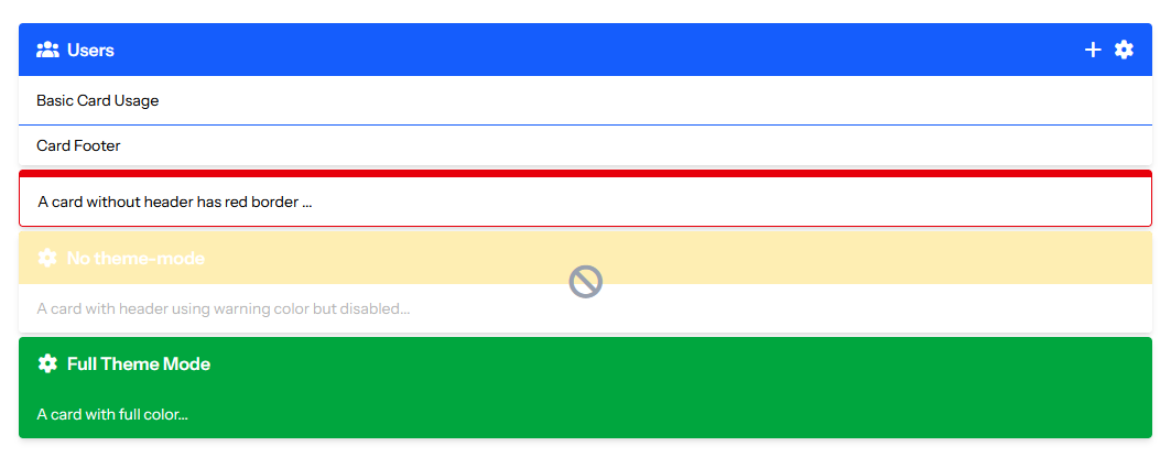
    <x-hwkui-card title="Users" icon="fas fa-users" theme="primary">
        Basic Card Usage

        <x-slot name="tools">
            <button class="cursor-pointer text-white hover:text-gray-200">
                <i class="fas fa-plus"></i>
            </button>
            <button class="cursor-pointer text-white hover:text-gray-200">
                <i class="fas fa-cog"></i>
            </button>
        </x-slot>
        <x-slot name="footer">
            Card Footer
        </x-slot>
    </x-hwkui-card>


    <x-hwkui-card theme="danger" theme-mode="outline">
        A card without header has red border ...
    </x-hwkui-card>

    <x-hwkui-card icon="fas fa-cog" title="No theme-mode" theme="warning" disabled>
        A card with header using warning color but disabled...
    </x-hwkui-card>

    <x-hwkui-card icon="fas fa-cog" title="Full Theme Mode" theme="success" theme-mode="full">
        A card with full color...
    </x-hwkui-card>
📦 Info Box Widget
For display small infos with icons or progress bar
Basic Usage
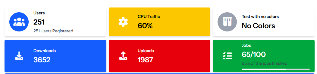
    <x-hwkui-info-box title="Users" text="251" icon="fas fa-users" iconTheme="primary"
        description="251 Users Registered" url="https://osama.app" urlTarget="_blank" />

    <x-hwkui-info-box title="CPU Traffic" text="60%" icon="fas fa-cog" theme="warning" iconTheme="warning" />

    <x-hwkui-info-box title="Test with no colors" text="No Colors" icon="fas fa-vials" />

    <x-hwkui-info-box title="Downloads" text="3652" icon="fas fa-download" theme="primary" iconTheme="primary" />

    <x-hwkui-info-box title="Uploads" text="1987" icon="fas fa-upload" theme="danger" iconTheme="danger" />

    <x-hwkui-info-box title="Jobs" text="65/100" description="65% of the jobs finished" icon="fas fa-tasks"
        theme="success" iconTheme="success" progress="65" />
📦 Small Box Widget
For display one info with beautiful UI
Basic Usage
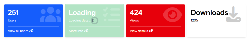
<x-hwkui-small-box title="251" text="Users" icon="fas fa-users" theme="primary" url="https://osama.app"
            urlText="View all users" urlIcon="fas fa-link" />

        <x-hwkui-small-box title="Loading" text="Loading data..." icon="fas fa-tasks" theme="success"
            url="https://osama.app" urlText="More info" urlIcon="fas fa-link" loading="true" />

        <x-hwkui-small-box title="424" text="Views" icon="fas fa-eye" theme="danger"
            url="https://osama.app" urlText="View details" urlIcon="fas fa-link" />

        <x-hwkui-small-box title="Downloads" text="1205" icon="fas fa-download" />
📦 Glass Box Widget
For display small infos with icons with Glass look
Basic Usage
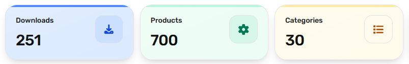
     <x-hwkui-glass-box title="Downloads" value="251" icon="fa-download" href="/admin"
            color="blue" />

        <x-hwkui-glass-box title="Products" :value="700" icon="fa-cog" href="/admin" color="emerald" />

        <x-hwkui-glass-box title="Categories" :value="30" icon="fa-list" href="/admin" color="amber" />
(blue-amber-emerald-red-cyan-violet)
📦 Timeline Widget
A versatile, highly configurable, dynamic timeline component for Laravel Blade applications built with Tailwind CSS. It supports vertical/horizontal flows, automated collection mapping, and complete granular slot overrides.
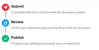
Component API Reference
<x-hwkui-timeline.timeline>
The main layout wrapper that handles orientation and sets the global design context.
| Attribute | Type | Default | Description |
|---|---|---|---|
items |
Collection\|array\|null |
null |
Passing data into this unlocks automated loop mapping. |
title-column |
string\|null |
null |
Key name to fetch the title from items. |
body-column |
string\|null |
null |
Key name to fetch description body from items. |
direction |
string |
'vertical' |
'vertical' or 'horizontal' structural rendering. |
color |
string |
'primary' |
Sets global theme color for indicators and lines. |
<x-hwkui-timeline.indicator>
The timeline hub point containing indicators and dynamic milestone bridge lines.
| Attribute | Type | Default | Description |
|---|---|---|---|
variant |
string |
'solid' |
'solid' (filled badge background) or 'borderless'. |
state |
string |
'completed' |
Passing 'last' breaks structural tracking and safely terminates lines. |
color |
string\|null |
null |
Pulls context theme; passing values explicitly overrides individual instances. |
Supported Color Themes
Your system comes with modern built-in palettes. Customizing colors sets consistent backgrounds, boundaries, and texts:
primary(🔵)success(🟢)danger(🔴)warning(🟡)pink(🌸)violet(🟣)gray(⚫)emerald(💚)sky(🌐)dark(🌗) (Automatic Light-to-Dark inversion support using standard class
Basic Usage
- Simple Version (Automated Collection Rendering)
When you pass an absolute collection data object into the
:itemsarray attribute, the timeline component handles all inner loops, mapping, checkmark icon injections, and terminates trailing lines flawlessly without extra layout markup.
<x-hwkui-timeline.timeline
    :items="$users"
    title-column="name"
    body-column="email"
    direction="horizontal"
    color="success"
/>
- Customized Version
For granular layouts, omit the :items attribute. You gain full creative authority to use conditional blade assertions inside, modify individual milestone theme colors, toggle distinct custom icons, or switch presentation variants.
Crucial Rule for Manual Loops
You must provide :state="$loop->last ? 'last' : 'completed'" or state="last" to your inner indicator so that the trailing line safely clips off at the end of your tracking row!
<x-hwkui-timeline.timeline direction="vertical" color="primary">
    @foreach ($users as $user)
        <x-hwkui-timeline.item>

            <x-hwkui-timeline.indicator
                :state="$loop->last ? 'last' : 'completed'"
                :color="$user->hasRole('admin') ? 'danger' : null"
                variant="solid"
            >
                <i class="fas fa-{{ $user->hasRole('admin') ? 'shield-alt' : 'user' }}"></i>
            </x-hwkui-timeline.indicator>

            <x-hwkui-timeline.content>
                <x-hwkui-timeline.title>
                    {{ $user->name }}
                    <span class="text-xs text-gray-400">({{ $user->username }})</span>
                </x-hwkui-timeline.title>

                <x-hwkui-timeline.body>
                    {{ $user->roles->pluck('display_name')->join(', ') }}
                </x-hwkui-timeline.body>
            </x-hwkui-timeline.content>

        </x-hwkui-timeline.item>
    @endforeach
</x-hwkui-timeline.timeline>